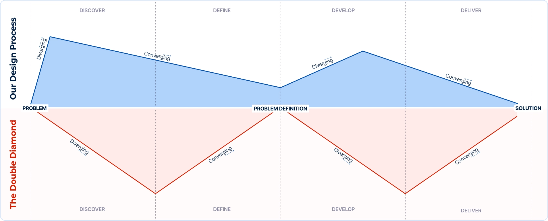
Exploring our approach to projects and how we've adapted the Double Diamond methodology to create a flexible UX design process
Continue reading
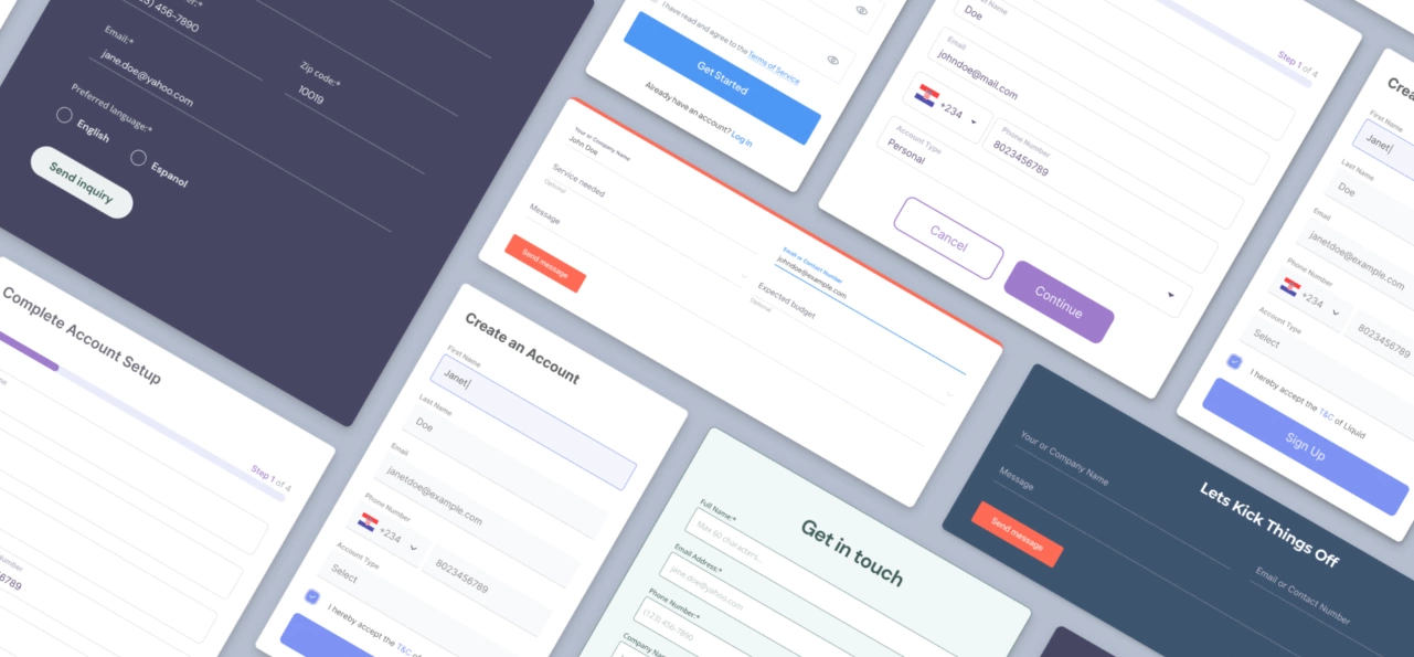
Web forms are “the last and most important mile in a long journey.” (Luke Wroblewski).
Despite their significance, web forms are often poorly though out so “closing the deal” via them is something that happens on rare occasions.
An average contact form converts only 1% of visitors which means that contact forms are by far the worst-performing type of web form businesses use.
These statistics can be both – inspiring and uninspiring. Why, you wonder?
There are two ways to look at this problem either contact forms are trash OR almost all brands (more precisely, designers) are failing miserably when designing an appropriate contact form for their type of business.
We can safely say that the latter is true. Contact forms often don’t get the attention they truly deserve and the consequences are easily noticeable in brands ability to generate sales leads.
There are multiple ways how to make good contact form, and in this article the focus will be on, in our opinion, the most important ones.
The classical minimalist approach is a good idea when you need only a few pieces of information from a user such as name, email, and message. Try to avoid optional fields when you can. On the contrary, limit it to one or two optional fields and be explicit about it (more about it later).
When you follow a minimal approach, you are following Hick’s law – one of the laws of UX. Hick’s law says that “the time it takes to make a decision increases with the number and complexity of choices”. Therefore, it is important to simplify choices for the user by breaking down complex tasks into smaller steps to reduce overwhelming users.
When we find someone attractive, we usually attribute other positive qualities to them… in social psychology this is called the “halo effect”. It is a phenomenon whereby we assume that if a person is good at doing thing A, that they will be good at doing things B, C, or D. Something similar happens in UX. If a website is beautiful and intuitive, we often believe that those interfaces are better, faster and we tolerate errors if they occur on stunning screens. When it comes to form filling, a task that causes annoyance and frustration, this is crucial. This is also known as the aesthetic-usability effect.
It is not enough for a contact form to be attractive, it also has to be designed in a consistent manner. Users are often bored or tired and they don’t want to think too much so it is important to make a form undeviating.
When there are no surprises you know what to expect. Familiarity helps when it comes to making a beautiful and functional contact form as well. Check boxes, radio boxes, dropdown fields – they do what they say. When a user sees one of those fields they instantly know what is being asked of them. This means that if the web form looks familiar, users will feel comfortable when filling it out and it is more likely for a user to complete filling out the form.
Familiarity is associated with so-called Jakob’s law which states that “users spend most of their time on other sites”. This means that users prefer your site to work the same way as all the other sites they already know. In other words, users will appreciate if your website looks and works similarly to other websites they visit.
As previously said, contact forms should be as simple as possible… but what to do when you need to use more than four or five fields? In these situations, you can follow the multi-step approach. Instead of showing all the fields at once, the multi-step forms create an illusion to a user of needing to fill in only one field, making the initial effort less challenging. This means that more users will fill out your contact form.
You might think… ”multi-step approach looks nice but does it actually work?”. Yes, it really does work – and not just for contact forms. It is proven that these kinds of forms get up to 300% more conversions. There are numerous reasons for this: first impressions for a user are less overwhelming, progress bars encourage users to complete the form and you can ask delicate questions at the end of the form when a user has already filled out the majority of the form and don’t want their effort to be in vain. It is proven that users tend to stay more focused when answering one question at a time.
When using a multi-step approach don’t forget to use a progress bar. It encourages completion and reduces anxiety for a user. The progress bar gives a timeframe which always provides a certain relief.
It does. A Baymard Institute usability study found that if a field is too long or too short, users start to wonder if they understood the label correctly. This is especially important when we ask a user to provide some unusual data or technical label like CVC (card verification code).
This means that designers should always adjust the length of fields so they are long enough to contain all the characters but not more than that. Also, some fields should be as flexible as possible. For example, the first name field should be flexible since there are a variety of names when it comes to length.
Avoid so-called “zig-zag” field placement. Eye-tracking tests have shown that users spend more time jumping from one column to another and have trouble identifying a specific field in the form. Instead of this, the one-column design makes it easier for a user to actually complete and understand a contact form better.
University of Basel researchers have found that left-aligning is a better option than center-aligning since users' eyes don’t need to jump across the page. This alignment ensures a smoother reading and input flow, reducing cognitive load and making the form easier to complete.
When the data is grouped on any kind of web form, it seems more attractive and intuitive. This helps in situations when a user wants to change certain information because then he/she can simply remember in which section (e.g. personal information, contact information, etc.) that field was.
Often, there are a bunch of mandatory fields instead of a few optional fields. Since this is a widespread practice, there are numerous forms with few too many red asterisks. Also, it is important to highlight that red colour causes negative associations since it is commonly used for error messages text, so try to avoid using it for this purpose.
It is proven also that asterisks are not clear for all the users. A simple solution is to avoid such misapprehensions with the usage of short text for optional fields (and as previously mentioned, try to limit optional fields to one or two of them).
Numerous fields can be autocompleted: email, phone, city, postcode, etc. Every time you have an opportunity to make users' lives a bit easier, they will appreciate it and your conversion rate will unquestionably increase. Despite autocomplete suggestions being common they often perform poorly with end-users. To achieve a high-performing autocomplete design try to avoid scrollbars, reduce visual noise, highlight the active suggestion, and keep the list manageable.
Users love different representations of data fields. For instance, it is good practice to use a radio button for gender types or designing obvious fields for mobile numbers, dates, etc.
In this context it is important not to forget on rules regarding input format:
When creating CTAs, use brief and clear names for them to decrease the path to completion. The primary purpose of this button is to catch the users eye and to instantly understand what button he/she should use to perform an action. CTA buttons should be the same width as fields. This way users will be certain where the CTA is located.
Designers should always predict form validations since this is one of the most important form functionalities. Basically everything should be designed, from error states to help text. Users should easily understand these messages. Form validation should be conducted in real-time primarily because it is quite annoying when after submitting the data, the user finds out that something has gone wrong.
Validation should not be too strict since it is a bad experience for users and it can have a negative impact on your business.
Generally, the role of a placeholder is to give a hint on what type of information is required for the particular field. Some designers started using placeholders as labels for aesthetic reasons, which is ok if the contact form consists of less than five fields. On the contrary, this practice can be really annoying if a user forgets the purpose of the field and needs to delete the input to find out the purpose. To prevent user frustration, it's best to use clear labels and reserve placeholders for supplementary hints.
Active areas of a contact form should be highlighted by changing the border colour and size of the field. This way users can stay more focused on one question when filling out the form.
The same concept can be used for errors as well
It is crucial to handle requests for sensitive information with care, as many users are increasingly concerned about privacy when providing personal data. When necessary, clearly explain why such information is required, using supporting text below the field. Ensure these explanations are provided in an easily understandable manner to alleviate user concerns.
The situation in which a user needs to clear the entire form is quite rare. More often users accidentally press clear when looking for the CTA button. When this happens, users can get irritated and usually will not fill in the form again. For this reason, avoid using clear or reset buttons on your web forms. Instead, focus on prominent and distinct calls-to-action (CTAs) that guide users smoothly through the form completion process.
The average adult finger pad size is about 10mm wide. In web terms, this is approximately 48 pixels. This means that designers need to make sure that fields have a height of at least 48 pixels. Also, the text should be at least 16 pixels in size. This is crucial if we want to accommodate for people with impaired vision (very common in older population).
Information should be asked logically from an average user's perspective. For example, it’s uncommon to ask for a customer’s payment details before confirming their order. This principle, rooted in Jakob’s law as discussed earlier regarding familiarity, suggests that users are more likely to complete a form if the information is requested in a sequence similar to other websites they frequent. Aligning with this principle enhances user experience and ultimately boosts a brand's ability to generate sales leads."
Did you know that 90% of our initial judgment of a website is based on a used colour scheme? You don’t need to be a designer to figure out which colour schemes work best. There are a lot of handy programs such as Adobe Color, Coolors, Color Hexa, HTML Color Codes, Paletton , and others. These programs will help you choose colours that reflect your business image.
We are all aware of the fact that filling out the forms is not anyone’s idea of fun, but it doesn’t mean they have to be designed poorly.
There are a lot of things that designers can do to make the user experience a bit better for the users. Probably the most important thing is to keep attention to detail and to avoid ambiguity.
By following these tips you’ll provide your visitors with an intuitive, friendly, and positive experience that helps you boost conversions.
Let us know if you have any questions or experience regarding web forms you want to share with our team.
If you are looking for a strong development team browse through our many services or give our team a shout! We look forward to helping your businesses grow through digital excellence.
Spread the knowledge and share this post