Website For Marko Buljan – Real Estate Developer From San Francisco
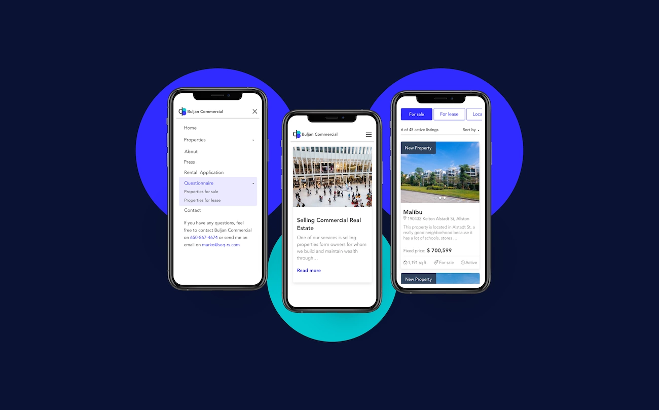
Our latest project was a website for our American client Marko Buljan. He is a real estate developer working primarily in the San Francisco Peninsula. He needed a simple yet unique website that will suit his commercial real estate needs perfectly.
The technical part of the real estate project
We got the clients wish list and reimagined what robes can our booking system wear. We’ve already had a robust application that supports content and property management coupled with a fast and reliable search engine based on Elasticsearch. Years ago we built an attribute value feature which had supported most of the client’s requirement but we were missing price and size options to accommodate the real estate industry. We’re proud of our technical team that the implementation of these new attribute types was smooth and quick. With small adjustments to attributes and property types, we managed to expand Goldfish and prepare it for a whole new industry.
Professional, streamlined design
We have built a professional, streamlined design with clean lines, a lot of white space, and many images of properties and the local area. Our main goal was to keep the design simple and to let the content and properties take center stage on the site since we took into account the balance between the user experience and the business requirements goals.
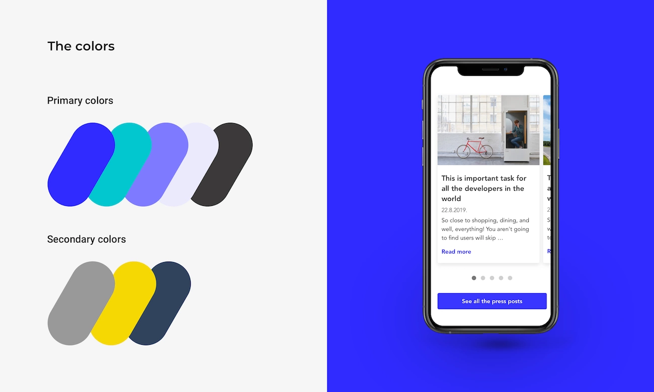
The color scheme used on Markos’ website is nourishing and has a youthful flavor to it. The primary colors are blue, green, and purple. We have used these colors since those in the cool category, like blue, typically evoke emotions of professionalism, skillfulness, and trust. Strategically using them on a particular website help tell visitors how to feel about the information presented to them.
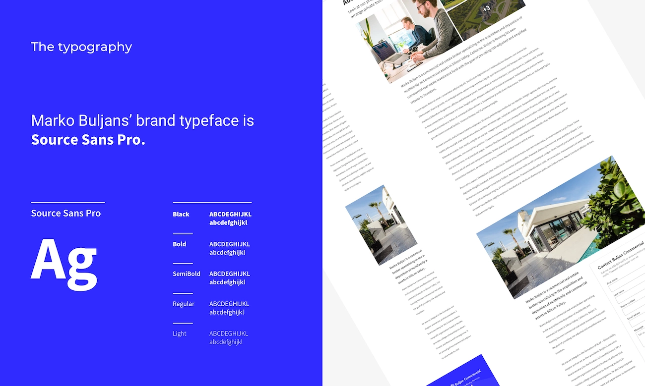
For the brand typeface, we have chosen Source Sans Pro. This typeface has clarity and legibility of twentieth-century American gothic typeface designs. Probably the most important characteristic of it is explicit clarity in both short and long paragraphs of texts.
The website is accessible on all devices because we wanted to ensure that all the prospective buyers, renters, sellers, and landlords had the best possible experience when using it. This is crucial since, according to data, 80% of users used a mobile device to search the internet in 2019.
Properties listings
It’s always good to be one step ahead of your competitors. Today’s property buyers and renters are forward-thinking centered and they expect to find almost everything online. This is the reason why we have incorporated an interactive map on Markos’ website. The map made the search easier and enjoyable for visitors, and potential clients will surely favor this website for it.
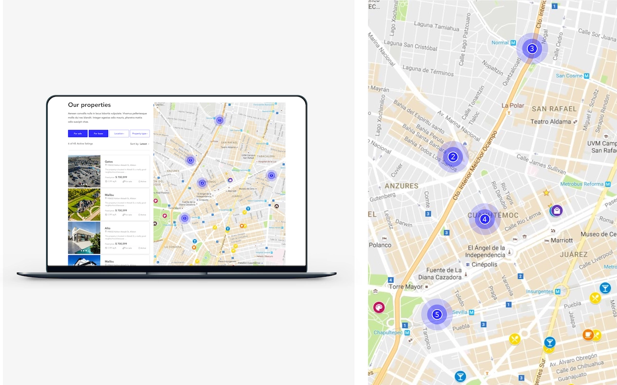
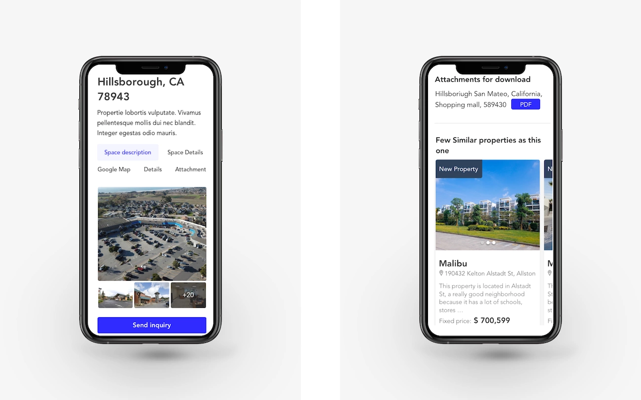
All the listings are presented in a simple yet informative manner. Each one contains a gallery with properties’ photos, space descriptions, details, location on the map, and the attachments for download. At the bottom of every page, users can find similar properties so they can easily browse through the site. Also, there is a fixed contact form next to the property details in case a user wants to get some information about the property or the particular area.
Other important features of this real estate site
Form for desired properties
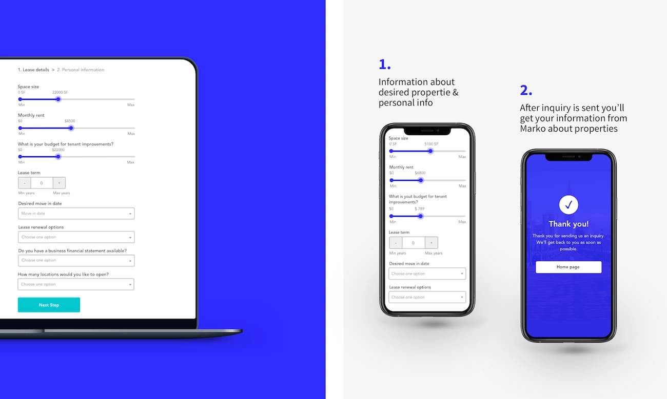
When looking for a perfect property the sheer volume of information can be overwhelming for buyers and sellers of all experience levels. Due to this, users value guidance when it comes to real-estate hunt. For this reason, we have incorporated two-steps web forms for users: one for investors and one for the renters. Users simply need to fill out these forms with information about properties and some basic personal information. After the users fill out the form they will get information about the properties that suit their needs from Marko personally. This way prospective buyers and renters get to save time and at the same time have more time to think about their real estate needs in the comfort of their homes.
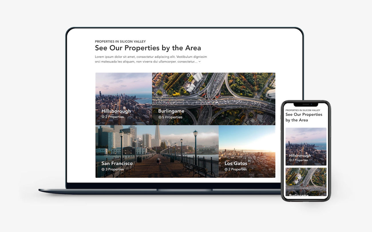
Properties by the Area
Since it’s not just properties the clients are buying or renting, it’s the area as well, we decided to display the properties by the area right on the homepage. In order to create a ‘one-stop-shop’ from this real estate site, those pages contain valuable information and images of schools, transport, and entertainment in the area.
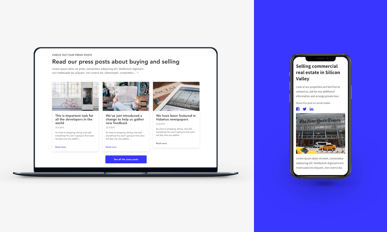
Real estate blog
A lot of small-business owners wonder the same thing: “Is it really worth time and effort to maintain a blog on a website?” We say yes, it definitely is. When you frequently post high-quality content, the visibility and credibility of your company to consumers will increase. Websites with blogs get more traffic than websites without blogs because it places you higher on search engine results than other websites. If you have more traffic, you have more opportunities to convert that traffic into leads. For this reason, we decided to incorporate the blog page into Markos’ website, and also to display it right on the homepage so it to be more prominent and noticeable.
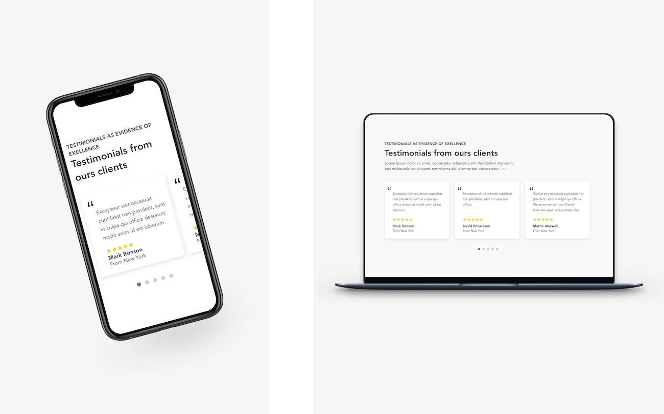
Testimonials
We wanted to make sure potential clients could see Markos’ traditional values and the importance he placed on face-to-face service so we placed the collection of testimonials from his most loyal clients. Clients’ reviews and testimonials are perfect examples of how easily you can tell to your user that you’re doing a great job.
Unquestionably, to appear in the list of top real estate agents, you should know the market well, be vocal, and … have a brilliant website.
The features we discussed in this article are essential for Markos’ business, but it doesn’t mean that your needs are the same. It’s up to you to decide what functional requirements your platform will have and our job is to translate them into action.
If you are looking for a strong development and design team or you have some questions for us, give our team a shout!
Or browse through our services.
We look forward to helping your businesses grow through digital excellence.


