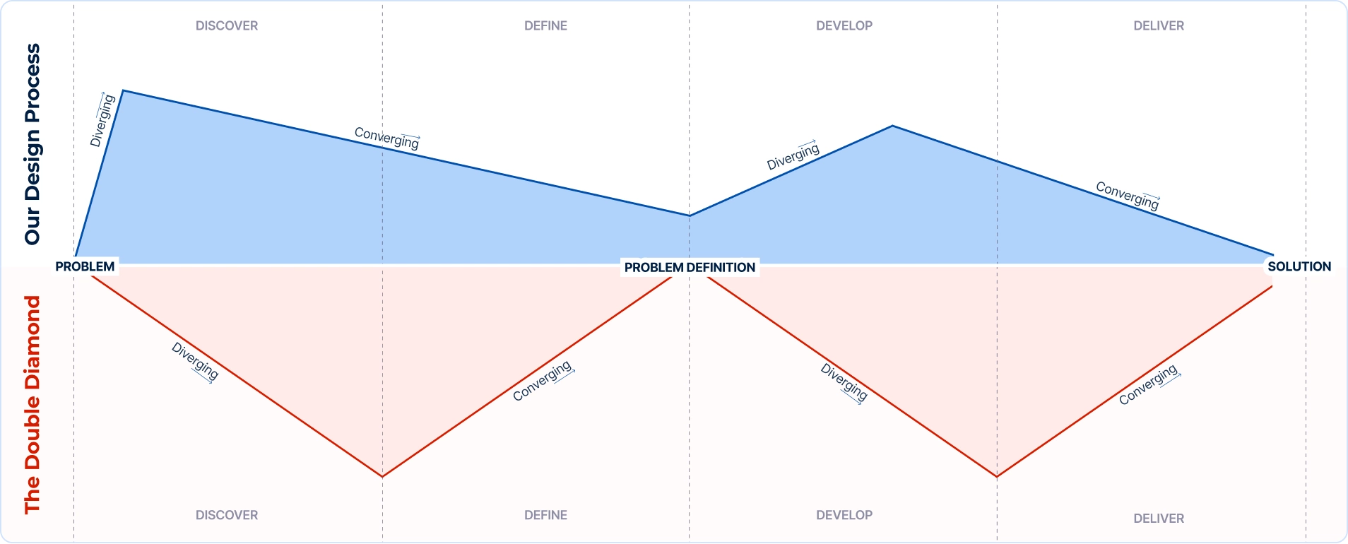
Exploring our approach to projects and how we've adapted the Double Diamond methodology to create a flexible UX design process
Continue reading
In this article we explore how light and shadows affect visual perception and design realism. From Material Design principles to practical tips, discover how shadows add depth and differentiation to user interfaces.
Have you ever taken a moment to notice how a sunbeam light changes the colors of objects and cast shadows?
Most of us are so accustomed to light and shadows that we rarely pay attention to it or think about how they “work”. Regardless, they provide visual cues with whom we interact throughout every single day. They give us information about texture, positions, distance, and other physical and tactile qualities.
Paying attention to the interaction of light and shadow in real life can give designers ideas on how to make designs look more life-like (if the goal is realistic appearance).
Shadows create depth in the interface which helps us to differentiate UI elements. However, adding elements of light and shadow into the design is not as simple as it sounds. Sometimes designers get carried away and by overdoing effects they make an otherwise decent-looking design look tacky. This often happens due to a lack of understanding of shadows.
Material Design is one of the frameworks that is devoted to the philosophy of the shadows. This android-oriented design language consists of guidelines and proposals on best practices of UI design.
In this article we’ll go through several subject matters: early days of GUI, basics about the light and shadows, shadows according to Material Design and in the end, we’ll go through, step by step, an example on how to create a good shadow on a specific design element.
In the early days, interfaces objects mimicked their real-world counterparts in how they appear (materials emulation) and how users can interact with them. The goal was to make interface objects familiar to users by using the well-known concepts. This is also known as “skeuomorphic” design. The best example of this is the recycled bin icon used for thrown away files. Early versions of Apple’s mobile OS used skeuomorphism heavily across its user interfaces: shiny buttons looked like “real” buttons, photos had white borders so they looked like physical photos, iBooks were designed like a real-life bookshelf, etc.
Designers and developers invested a great amount of time into making just about everything on GUI appear realistic. They have used various pseudo-3D effects like shadows, gradients, and highlights to give an impression to a user that they can interact with those elements. Even though visual elements vary from an application to an application, users rely on two assumptions:
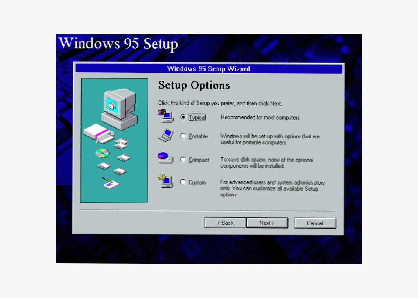
The following image shows how the usage of shadow on the Windows 95 Setup box helped users to understand which elements are interactive, and which ones are not.
These days it is widely debated whether users are so accustomed to interacting with GUI that skeuomorphism is no longer needed. Opponents of skeuomorphism say that interfaces with natural-looking objects look crowded and that objects who mimick their real-world counterparts are meaningless to users today. On the other hand, proponents argue that humans will never be accustomed to the digital world as we are to the physical world so the skeuomorphic design concepts should not be abandoned.
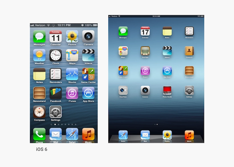
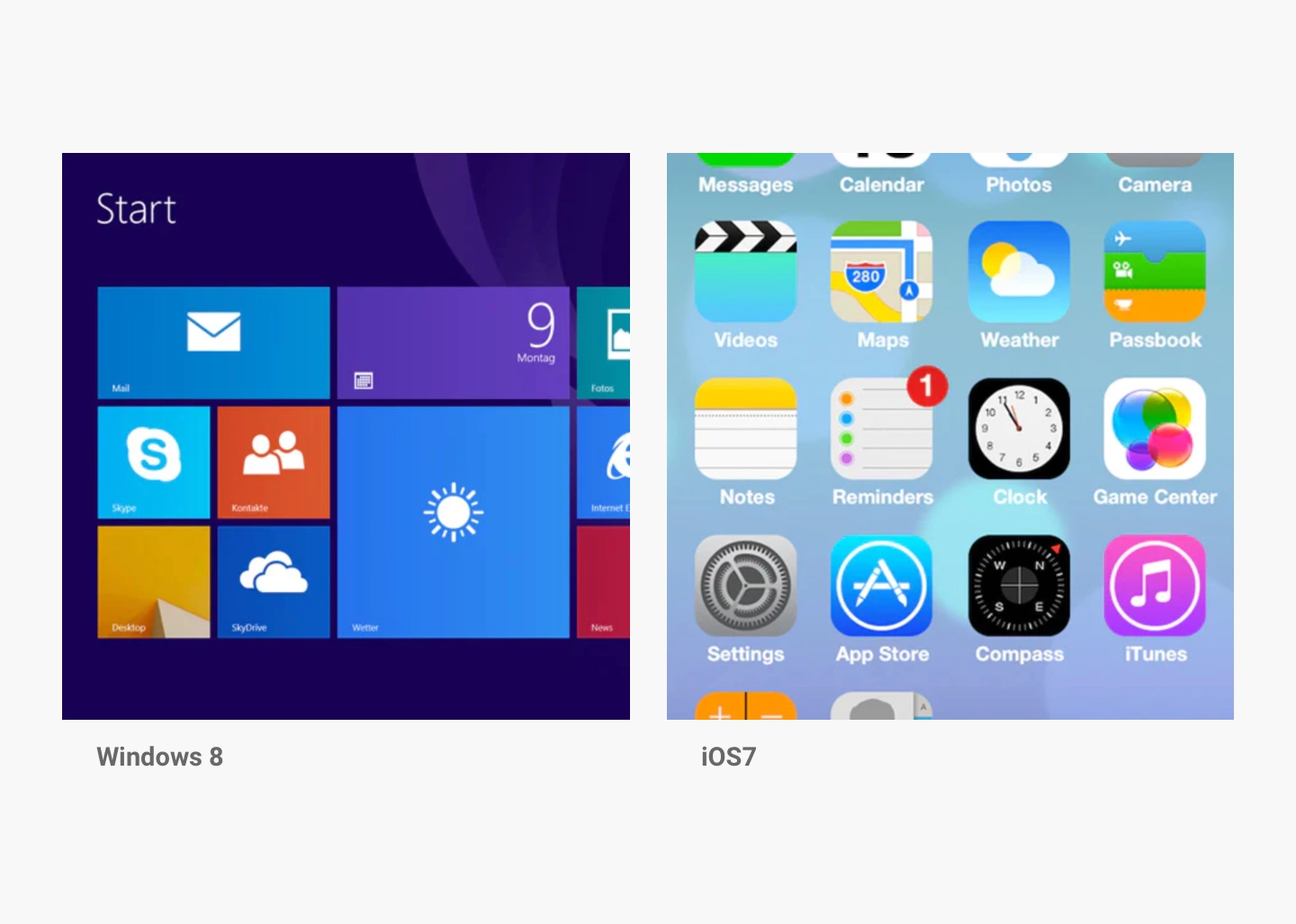
For every action, there is a reaction. In the world of design, flat design was a reaction “against” skeuomorphism. In both Windows 8 (2012) and iOS7 (2013), we have seen a rather bold transition to flat design. Once shiny buttons lost their depth, icons no longer had the drop shadows, and the gradients were used minimally.
Designers have begun to realize the usability issues (usability problems = bad site) of flat design such as low distinctiveness of the user interface and poor comprehension of possible actions. As a result, a more balanced interpretation of flat design emerged: “almost flat” or “flat 2.0” design. This design style is mostly flat, but it uses subtle shadows, highlights, and layers to create depth in the UI. The best example of this flat 2.0 is Google’s Material Design, with the principles borrowed from physics. It provides simplicity without sacrificing visual cues.
As previously mentioned, incorporating shadows into designs is not always straightforward. This and many other aspects of design are untangled in Material Design, an android-oriented design language created by Google. It consists of guidelines, components, and tools that support the best practices of UI design. According to Google, Material simplifies the collaboration between designers ad developers, which in the end helps teams to create more quickly beautiful products.
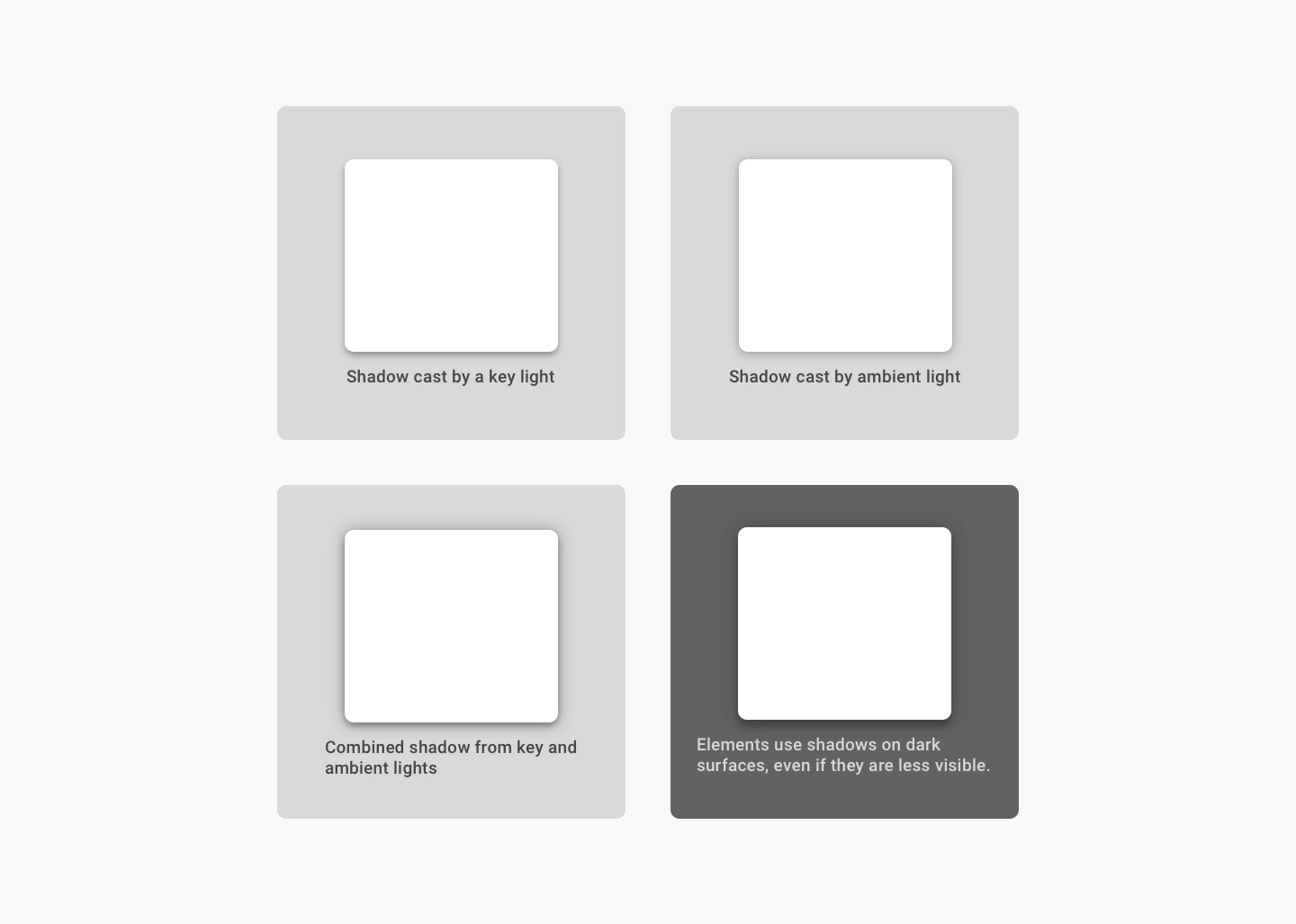
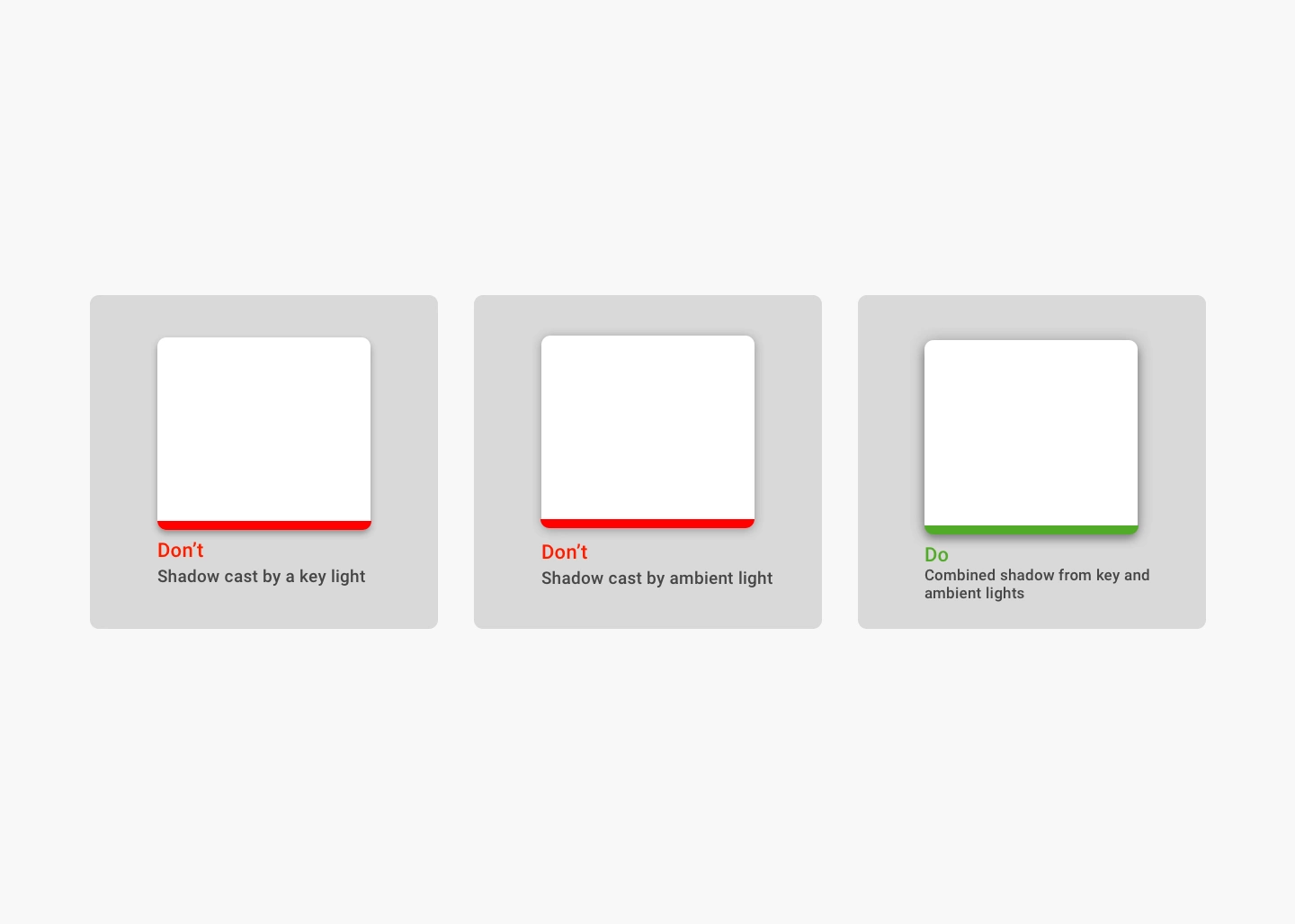
In the physical world, objects can be stacked or attached, but they can not pass through each other. Instead, they create shadows and reflect light. In the Material Design environment, virtual lights illuminate the UI. There are two types of lights: key lights and ambient lights. Key lights create sharper, directional shadows, which are called key shadows. Ambient light appears from all angles so they create soft shadows, called ambient shadows.
In Android and iOS development, shadows occur when light sources are blocked by material surfaces at various positions along the z-axis. According to Material Design, the best practice is to combine shadows from key and ambient lights.
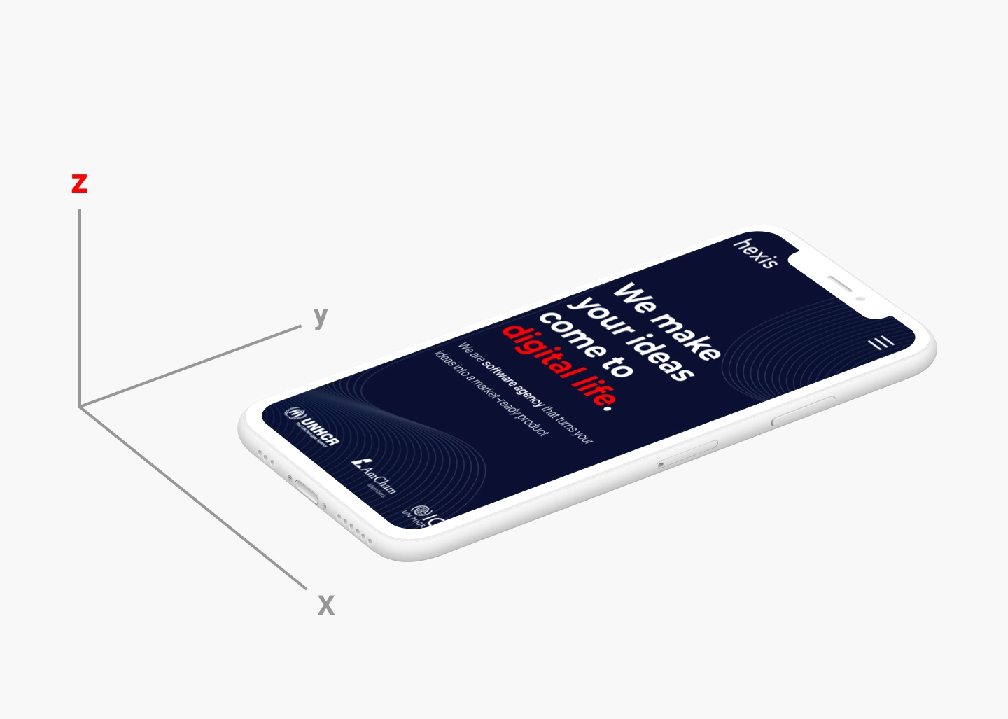
Modern interfaces are layered and take full advantage of the z-axis. The positions of the objects in the z-axis act as cues to the users: they (shadow) indicate the hierarchy of elements, their depth, directions of movement, surface edges and sometimes they also help users to understand that one object is above another. This way users understand the UI intuitively because most of the interfaces follow similar patterns.
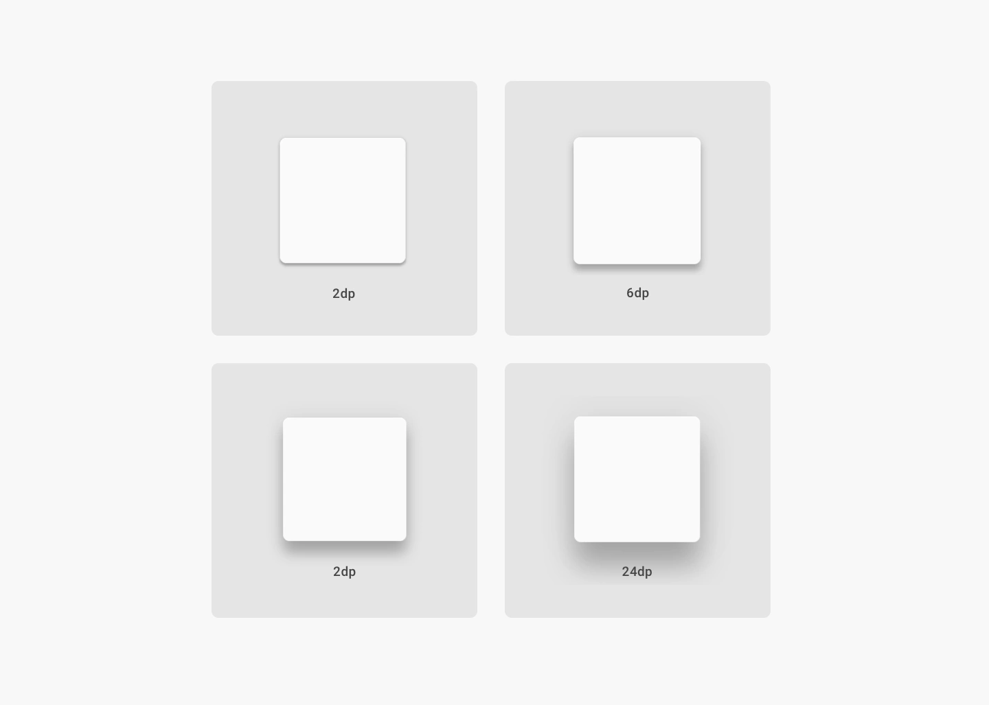
Elevation is the relative distance between two surfaces along the z-axis. It indicates the distance between surfaces and the depth of its shadows. Surfaces at higher lever have larger shadows, and those at lower levels have smaller shadows. Since shadows indicate the degree of elevation between surfaces, they should be used consistently throughout the product.
In the image below you can see how the shadow gets bigger and blurrier the greater the distance between object and ground is.
Some elements have dynamic elevation, meaning they change elevation following the user’s input. For example, buttons can be normal, focused, pressed, etc. Shadows provide cues about the movement – whether the distance between objects and surfaces is changing. For a user to feel certain if something is clickable they need an immediate cue after clicking or tapping elements. According to Material Design guidelines, if your product doesn’t use shadows, you should create them in some other ways, such as parallax motion.
Designers use shadows for multiple reasons: to improve the overall aesthetics, to add levels of depth and realism to the user’s visual experience and to additionally improve the product’s functionalities. To achieve this, shadows should simulate real-world light dynamics (key and ambient light) and they should blend into the design effectively.
The image below shows a card design that violates those principles.

There are multiple ways we can improve this card design by simply following the tips from the Material Design guidelines.
Direct light is light from one source and it is shined directly on the object. For example, when the sun is out, there will be a hard shadow on the other side of every object. This is the direct light we mentioned earlier.
Firstly we’ll remove current shadows from the card and then we’ll add direct light:

Ambient light is light that bounces off the surfaces around us. For example, when it’s cloudy and the sun is hidden, there are no direct light shadows. But if you look under the trees, you’ll be able to see a soft shaded area underneath them. This happens due to the presence of ambient light.
When we add ambient light to the card, it looks like this:

Using similar color to the element beneath the card will give another level of realism to your design because in the real world things don’t get blacker when the shadow casts them…they become few shades darker of the color they already are. Also, this is currently trendy so your design will look both modern and “more real” at the same time.
Back to the card design…we simply pick a color of the element behind the card and make that color darker and more saturated. This would look something like this:

The last thing we can do to improve this card design is to add an inner shadow to the profile image. The reason for this is the fact that users sometimes upload images that have a similar color as the element behind the profile image.
When we add some medium-soft inner shadows on a profile image it looks like this:

Your design shouldn’t rely on extreme gradients, heavy drop shadows or crazy lighting effects since all of them can distract users from their main purpose. Stick to subtle shadows which will inform users about the object’s relationships with each other and potential interactions with these objects. They will also improve the aesthetics of elements and add levels of depth and realism to the user’s visual experience.
By following these few steps from Material Design on how to make a good shadow, your future designs will flourish.
If you are looking for a strong development and design team or you have some questions for us, give our team a shout!
Or browse through our services.
We look forward to helping your businesses grow through digital excellence.
Spread the knowledge and share this post